
Could this be the “real man on the Shroud”?
Incidentally, if you turn your laptop 90 degrees clockwise, and look at that sharp boundary between light and dark on the face (subject’s own RHS), you will see two lines of the so-called “writing” that received so much interest and publicity some 3 years ago. I have an open mind as to whether they really are letters, especially when they are said to be a mixture of Greek, Hebrew etc. It would be more convincing – on grounds of probability – if the letters were all in one language. Christ’s death certificate (as claimed)? Ah, what it is to have the eye of faith…
Please note: this is not my major “Shroudie” site. See also this one, more scientific, less argumentative…
This is quite a realistic-looking image, would you not agree, of the Man on the Shroud? Is it my imagination, or does he not look younger than in the other images, like someone in his early 30s, despite the highlights on the beard? It’s also I believe a lot more scientific in the way it has been produced than many, perhaps all previous images. “Scientific” please note, not necessarily a more faithful representation of the original subject – human, superhuman, divine or inanimate ( metallic bas relief?) from which it was derived, of which we shall probably remain forever ignorant.
Clue: this picture is not the result of trial-and-error knob-twiddling in image-enhancement programs to get the prettiest representation of the Man in the Shroud….
Would anyone care to guess how this image was referenced to the real world? Looking at my previous postings, here and on my earlier two sites (WordPress and Blogspot) may provide a clue.
Answers invited. I will post a step-by-step series of photographs tomorrow, showing how this image was obtained…
Update: Monday 19 March
Can you see what it is yet? Here are two clues – a word and a picture. The word is “normalise” (U.S. normalize), one meaning of which is “to make conform to”. And here’s the picture, which I have posted previously as a kind of tour de force, says he unabashedly.

The starting point for this image was a horse brass featuring King George VI. But the imaging did not involve photography, at least not initially…It involved a different kind of -ography, the sort that was available in medieval times…
Update: 19th March
OK, so want to know how my Shroud image was scientifically normalised, i.e made to conform? It was made to conform with an image on linen that shares important characteristics with the Shroud image, but with the difference that its precise provenance was known.
Here is the image, or rather two of them:

Benchmark images against which my Shroud 3D enhancement was referenced.
So how were these images produced? They were produced by branding linen with a hot metal template to produce light scorches. In fact, by repeatedly stamping across a width of linen with the same heated template, as in the photograph above, the template rapidly cooling, one produces a series of images that get fainter and fainter until finally there is no visible image at all. (The only reason I mention that is because some rather tedious individuals persist in telling me that my scorch images fail their test of “superficiality”, but let’s not waste time on that needless distraction right now, except to say that my scorch images can be as superficial as I want, simply be “serial stamping” as described).
Why do I say the scorch images share important characteristics with the Shroud’s?
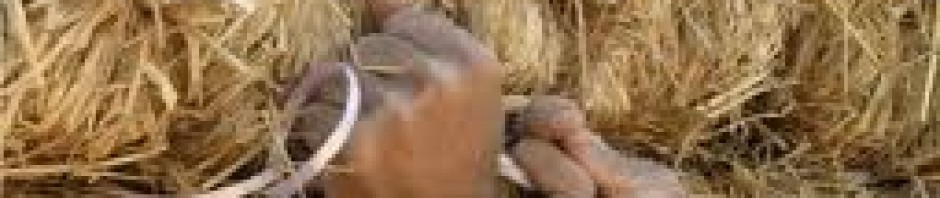
Here’s the template from which my scorch images were produced.

King George VI, taken from an English horse brass.
Compare the scorch image above with the original from which it was taken:
1. The scorch is a “negative” image, i.e. light/dark reversed, or as some call it to distinguish from photography, a “pseudo-negative – in the same way that the Shroud has a pseudo-negative image.
2. There is no directionality in my scorch image, i.e. no pattern of light of shade or tonal contrasts that suggest light coming from a particular direction – in the same way that the Shroud image has been described as having no directionality.
3. The scorch image is intrinsic to the fabric itself, i.e. not applied pigment, in the same way that the Shroud image is generally considered to be intrinsic to the fabric, representing cell wall carbohydrates (hemicelluloses, celluloses etc that have been dehydrated, oxidised, crosslinked etc).
4. My scorch image is highly superficial, or can be if I chose to operate at the limits of visibility. (Whether it corresponds exactly with the 200nm thickness figure that is bandied around (for which so far I have found scant documentation, except that it is below the resolving power of a light microscope) I cannot say, but common sense tells one that a scorch image can be made as superficial as one wants through control of temperature, application time etc. There are no grounds for thinking that there is a minimum or maximum thickness of scorch image.).
5. My scorch image is approximately the correct colour, ie tan, sepia etc, the precise shade depending on the severity of the scorch.
6.My scorch image contains encoded 3D information, as shown in my numerous previous posts, by the ability to produce 3D enhancement, e.g. with ImageJ software, in the same way that the Shroud (and its 1532 scorch marks) respond to 3D imaging software.
In short, my scorch image serves, at the very least, as a working model for the Shroud image, one that meets no less than 6 key criteria as listed above. But I know the origin of my image, so can enhance the scorch image to match it. Those same settings can then be applied to the Shroud to obtain an image that is less likely to have artefacts than one produced working totally in the dark, so to speak, merely adjusting parameters to see what effect that has on the Shroud image alone – with no reference points or benchmarks relevant to a Shroud-like image.
Back to the practical details: here are the final 5 steps in processing the scorch image:

First step: reverse the scorch image to match the template (makes comparison easier)

Reverse light/dark tonal values to match those of the template.

Next step: enhance the image in ImageJ software, giving just sufficient 3D character to match the relief of the original template. This image has had some added colour effects, needless to say.

Now apply the same settings to the Man in the Shroud
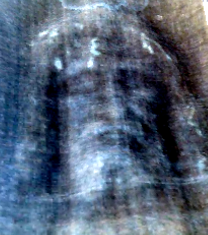
Crop the image to produce the one that introduced this post – a normalised image of the Man in the Shroud, referenced to a model system for imprinting a Shroud-like image onto linen from a 3D subject.
Roundup: I began by listing 6 ways in which the Shroud image shared characteristics of a scorch image on linen, some of which, notably the negative image, are inevitable consequences of a branding procedure, but have never been explained by any other mechanism,e.g. involving light or other radiation.
When as here one finds that one’s model system can guide the choice of parameters for 3D enhancement, such that they carry over with out further fine -tuning to produce what I at least would consider a very acceptable image, then a further surmise becomes possible, based on the balance of probabilities. That is that the Shroud image is itself the product of a scorch, one requiring direct physical contact between subject and cloth, and one which importantly requires the subject to be very hot, possible in the region of 200 degrees Celsius (I am unable to be more precise at present). A real human subject, not even a dead one, can be that hot while its major component is water, boiling point 100 degrees C. Ipso facto, the subject from which the Shroud was imaged was not a person,but more probably an effigy of a person, e.g. a bas relief, or possibly a bronze statue. Taken with carbon-14 dating, that would suggest that the Shroud is/was a clever hoax, produced by thermal imprinting (“branding”). Proving that may be difficult, perhaps impossible, given the passage of time and the changes that are likely to occur in a scorch image (e.g. that might account for its lack of fluorescence under uv light, which we are told is a characteristic of the 1532 scorch and perhaps(?) modern scorches too). But there is enough evidence here, I believe, to make scorching the most likely means by which the Shroud image was produced.
So why is scorching so rarely mentioned, and when it has, been quickly and dismissively, sometimes contemptuously ruled out – almost as if a taboo subject one might say. That is a question I shall be addressing in future posts, and I have to say my thoughts right now on an entire generation of Shroud investigators, many if not all of whom are or were self-selected, and who posture as “Shroud experts” are none too charitable. Be warned – this blogger/retired scientist does not pull his punches. There has been gross and persistent abuse of the scientific method in the world of Shroudology, all with a view it would seem to perpetuate the notion of unsolved mystery, of science being stumped to produce answers. These so-called scientists, the ones who congregate at Shroud symposia, few of the proceedings of which ever reach the peer-reviewed literature, have not been part of the solution and are never likely to be. They have instead been part of the problem, not just for years but decades. It is time that folk with a technical and/or scientific background who are not fooled or intimidated by pseudo-scientific mumbo jumbo blew the whistle on this grotesque charade.

Pingback: Did you know there is a high-definition image of the Turin Shroud (most of it still under wraps)? | Casting a critical eye at that Shroud of Turin
Pingback: Shroudie Congresses – places where fantasies are peddled… | Casting a critical eye at that Shroud of Turin